
Namonai Ike
Namonai ike in Japanese means, “a pond with no name.” Known for its picturesque beauty, this small village pond in the middle of Japan is neither named nor marked on a map.
Namonai ike in Japanese means, “a pond with no name.” Known for its picturesque beauty, this small village pond in the middle of Japan is neither named nor marked on a map.
A golden spaceship awakens after a thousand-year stasis and blasts off toward its planet of origin.
“You start every day and try to keep on moving, but when you find yourself in an environment where meaning shifts and you have the opportunity to question its essence, it is like looking at reincarnation from aside: how process involves different states of being and perspectives.”
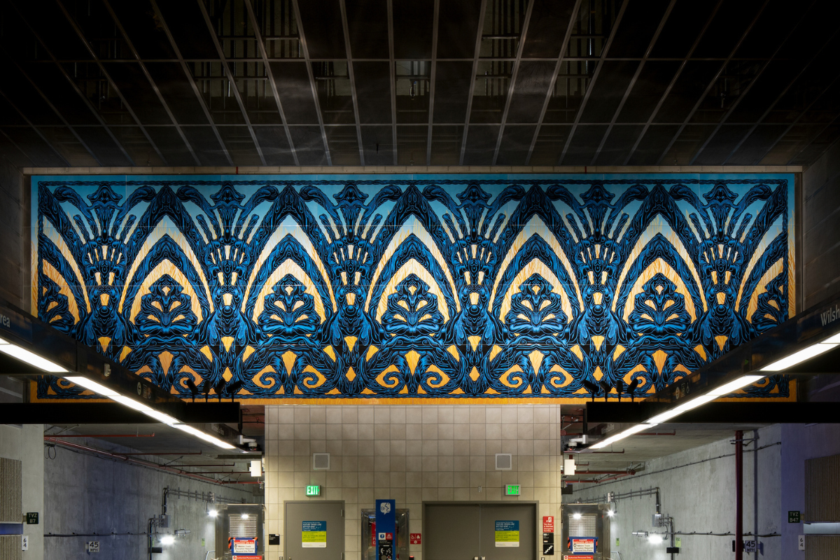
Mark Dean Veca’s artwork concept for the station platform draws from the art deco details of the nearby Wilshire Tower building and the past and present geology of the Miracle Mile neighborhood through stylistic references to barley fields and tar.
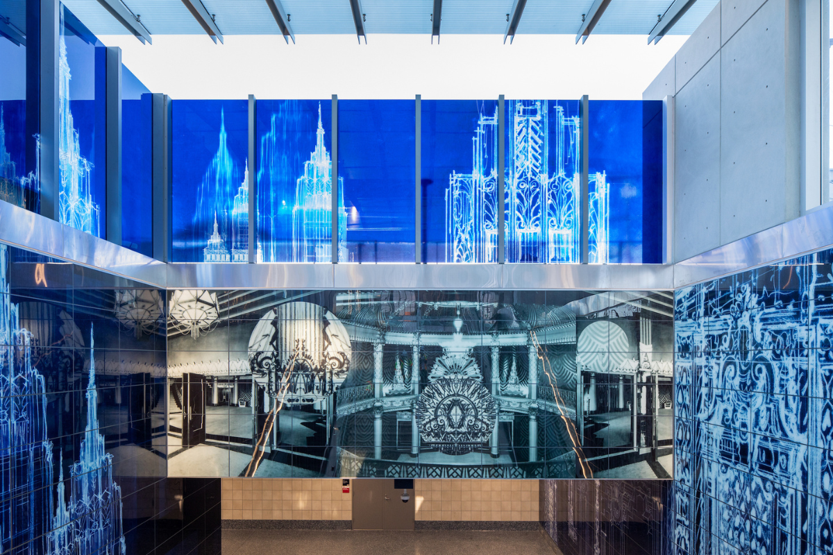
Todd Gray’s artwork concept for the station’s glass entrance plaza and escalator landing walls juxtaposes archival architectural drawings by S. Charles Lee and historic photographs of the nearby Saban Theatre (formerly the Fox Wilshire Theatre) with a multicultural selection of iconic textile patterns.
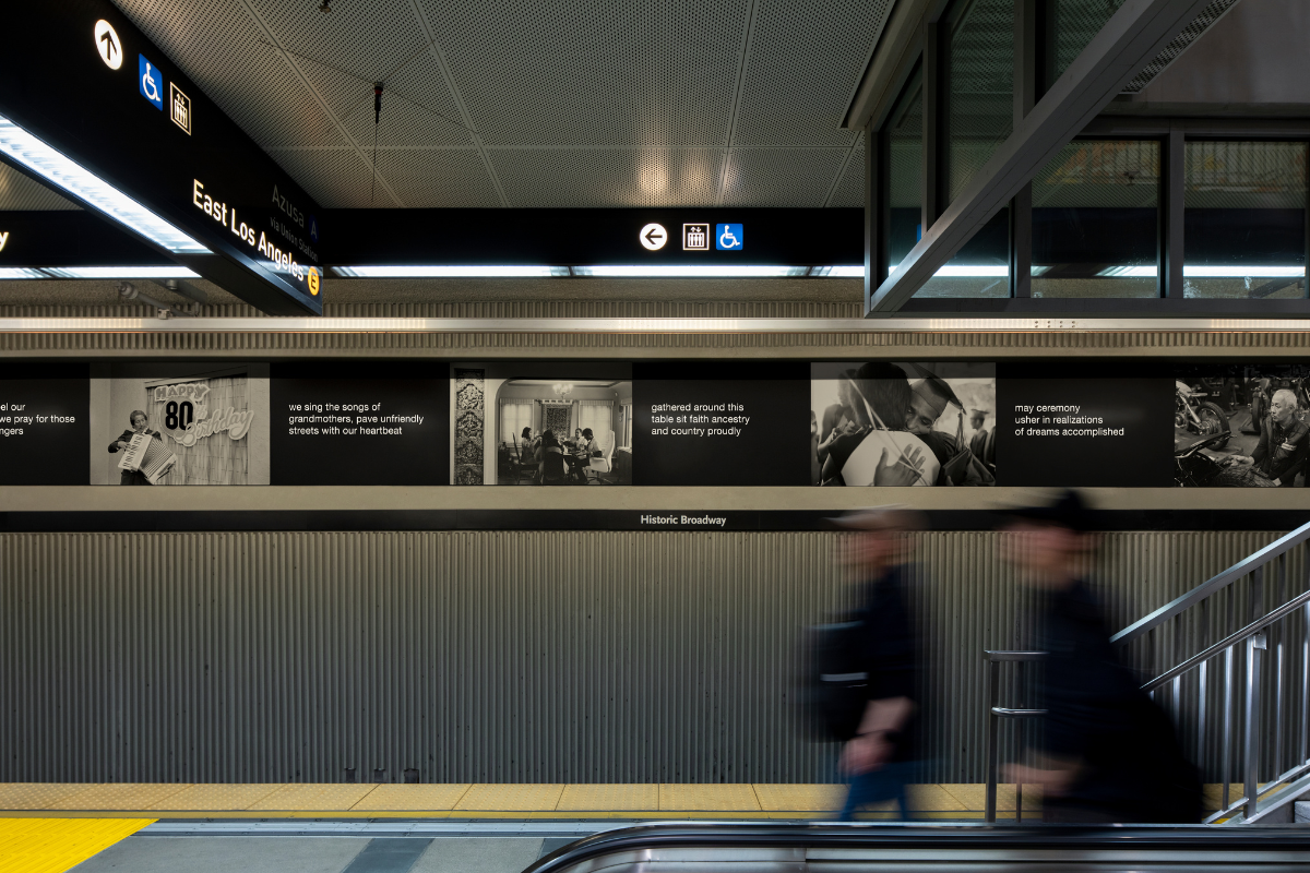
With particular emphasis on the often-overlooked migrations of Black Americans, Clarence Williams’s deeply personal artwork, Migrations, for the platform of this downtown station pays tribute to the area’s legacy as a place where scores of migrants first made their way to Los Angeles.
Set in a not so distant future, we envision the streets of Los Angeles unhindered by the inefficiency and congestion of the internal combustion engine.
Between the texts are holes where the sunrise peeks through the paper. When the sun sets, only the dots appear but when the sun rises, the light penetrates the paper to reveal the texts – the memories in between.
Project Description The primary artwork features a series of aluminum almond shaped panels that echo the shape of the platform canopy. The panels contain images from the past and present-day Boyle Heights community, and are cut out to depict images of historic transit tokens and landmarks in a style reminiscent of papel picado (cut paper) and Japanese wood block prints. Laminated glass canopy skylights also include artist selected images of local history and iconic travel imagery. On the west end of the station landscape area, large metal sculptures forming the words “TO…”, evokes the famed Hollywood sign and creates a new landmark. Artist Statement “I am striving to create an exciting day environment. I was inspired by images of transportation tokens from all transit periods in Los Angeles and how this element of our collective histories carries with it personal stories of travel. I intend to use local architectural landmarks which will also bring a familiar image of travel to the station experience.” About the Artist JOSE LOPEZ is nationally recognized for his innovative light-based designs, creating stage …

Sonia Romero created 13 artworks documenting her observations of MacArthur Park as an urban oasis.

Phung Huynh designed terrazzo paving areas and porcelain enamel steel panels for station platforms. The completed works display ‘lucky’ Chinese cherubs with California poppies, and Chinese cherub pilots in a surreal yet travel-friendly atmosphere of airplanes, birds and flying oranges.

While these collected discards are often overlooked by passersby, the artist re-presents these materials as the central focus of the landscapes, suggesting that they reveal potential narratives about the people who frequent the area. 26th St/Bergamot Station is located in close proximity to Bergamot Station Arts Center, a major hub for artistic activity.

Located in the heart of Boyle Heights, the artist’s goal is to create a focal communal space for the multi-generational communities of the area. Images of birds, alluding to migration and travel is the theme throughout portions of the plaza, escalator walls and mezzanine.

By weaving cultural identifiers with elements that denote the passage of time, artworks create a sense of shared place and historical significance that honors the heritage of the local, the immigrant and the tourist alike.

Project Description The layered cyan, magenta and yellow transparencies in Matthew Brandt’s photographic series L.A. Flow (2016) were processed through a waterfall system that pumps Los Angeles tap water over the surface of each monochrome print. It took weeks for the water to erode the pathways that form the images. Alluding to the necessity of interdependence, the artworks are a reminder that the city’s municipal water system, like Metro, connects us all through an infinitely shifting network of relations that are essential to everyday life. These artworks are part of the Metro Art Photo Lightbox Series and will be displayed in select stations between 2017 and 2020. Artist Statement “Recent events throughout the United States have shown us the fragility of municipal water systems and the power of civic stewardship. Though the populace of Los Angeles is economically and culturally diverse, we all drink from the same tap. Our daily decisions impact those around us.” About the Artist MATTHEW BRANDT (b. 1982, Los Angeles) earned a Bachelor of Fine Arts from the Cooper Union for the Advancement of …

Jose Lozano’s LA Metro Lotería plays with the station name “La Brea,” retaining the Spanish language prefixes “La,” “El,” or “Los,” and substituting “Brea” with passenger interactions commonly encountered while riding Metro.

Project Description The daytime images were taken directly into the sun, and depict highways as meandering rivers. The nighttime shots move from representation to abstraction becoming a reversed celestial sky. Artist Statement “I couldn’t resist the concept of placing work made about LA itself a couple of years ago in the entrances to its underground circulatory system. This series is comprised of three key daytime aerial images of Los Angeles and four night aerial shots alternating through the seven photo lightbox sequence.” About the Artist MICHAEL LIGHT is a San Francisco-based photographer and bookmaker focused on contemporary American culture’s relationship to the environment. He has exhibited extensively nationally and internationally, and his work has been collected by the San Francisco Museum of Modern Art, The Getty Research Library, The Los Angeles County Museum of Art, The New York Public Library, and the Victoria & Albert Museum in London. He is the recipient of the Simon Guggenheim Foundation Fellowship in Photography. Display year: 2010 – 2013 Locations: Vermont/Beverly StationNo longer on display
Project Description George Legrady’s work consists of a series of vibrantly colored porcelain enamel steel panels, 14’ x 22’ 6” at the angled concrete wall above the staircase and escalator unit at the LA City College entrance of the station. The algorithmically generated abstract rendition uses statistical transit ridership data to create visual patterns. Artist Statement “The design concept for the image has been to engage the kinetic experience of the downward movement on both escalator and staircase and escalator, one smooth, the other sequential”. About the Artist GEORGE LEGRADY received a Masters of Fine Arts degree from the San Francisco Art Institute. Recent interactive installations have been exhibited at Ars Electronica, the San Francisco Museum of Modern Art and the Centre Pompidou, Paris. He has been awarded Creative Capital Foundation and National Endowment for the Arts grants. He currently holds a joint faculty appointment in the Media Arts & Technology graduate program and in the Department of Art of the University of California, Santa Barbara. Public Art commissions include the Seattle Public Library and Metro …

Artist Ries Niemi has created 550 linear feet of hand-wrought fencing for this station, influenced by the historical Art Deco buildings of Pasadena, the Craftsman Style detail of architects Greene & Greene, and the beauty of machines and trains from the Industrial Revolution.

The overall theme and design of the station was established by artist James Doolin and architect Tanzmann Associates, while artist Anne Marie Karlsen designed and produced the nearly 4,000 square feet of hand-painted tile murals.
Project Description Daniel Marlos designed terrazzo paving areas and porcelain enamel steel panels for station platforms. There is a long history of quilting in this country. Many designs are centuries old and have descriptive names that correspond to important events. ‘Road to California’, ‘Railroad Crossing’, ‘Wandering Paths’, and ‘Wagon Wheel’ are just a few that actually deal with transportation. The selected pattern, Journey to California, is a pattern that references both California and travel. Artist Statement “Several years ago, I took my interest in structural film and photography, and expanded my media to include the handmade quilt. Duration, repetition, representations of time and space, mathematics (especially geometry) and the interstices between shots and images create a strong visual style that translates to the quilting medium.” About the Artist DANIEL MARLOS, born in Youngstown, Ohio, received a Bachelor of Fine Arts from Youngstown State University and a Master of Fine Arts from Art Center College of Design in Pasadena. He is an installation artist, whose primary media has been photography and film. He has recently expanded his …

Project Description Beautiful photo images depict piles of the not so beautiful remains of mass consumption, serving as visual reminders of the roles we all play in America’s unsustainable culture. Artist Statement “I am appalled by these scenes, and yet also drawn into them with awe and fascination. The immense scale of our consumption can appear desolate, macabre, oddly comical and ironic, and even darkly beautiful; for me its consistent feature is a staggering complexity.” About the Artist CHRIS JORDAN has exhibited his work internationally and is the recipient of the Greenleaf Award and a Lannan Foundation Production Grant. Based in San Francisco, Jordan’s focus on sustainability and waste not only have afforded him exhibition opportunities but also speaking engagements at Green symposiums and conferences. Display year: 2010 – 2013 Locations: 7th St/Metro Center Station No longer on display

In Statom’s work, Into the Light, five ordinary objects—house, ladder, leaf, cone and diamond—become extraordinary when suspended in the Westlake/MacArthur Park Station’s skylight area.

Project Description LaBelle’s photographs depict some of LA’s most iconic apartment hotels located in Hollywood, Koreatown and MacArthur Park neighborhoods. These mystifying images draw awareness to important aspects of LA’s past that may have been forgotten. The long exposures give the neon a smoldering luminosity, while the palm trees, illuminated with a hand held spotlight serve as a silent witness to the buildings and their history. Artist Statement “My aim in making these images was to call attention to places in the city that are often overlooked and to illuminate aspects of the city’s history which have been forgotten. Literally casting a light on the past, my hope is that these images will renew the enchantment of the city for those of us who have come to take its beauty and strangeness for granted.” About the Artist CHARLES LABELLE obtained his Master of Fine Arts from the University of California, Los Angeles. He has exhibited in galleries throughout the United States and Europe. He was a recipient of a Rockefeller Foundation, Bellagio Center Study Fellowship in …

Inspired by the geometric details of the art deco architecture along the Wilshire corridor and in greater Los Angeles, Eamon Ore-Giron’s artwork concept for the glass entrance pavilion and escalator landing walls of this station references the past while looking toward the rapidly changing future of Los Angeles’s streetscape.